Tillamook Summer Mashup
Is it hot in here?
A delicious new brand identity for Tilamook’s new summer flavor.
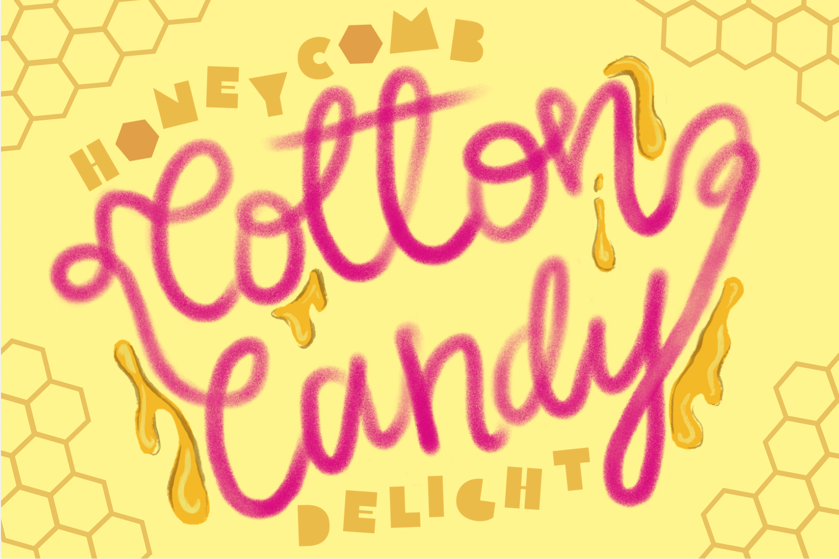
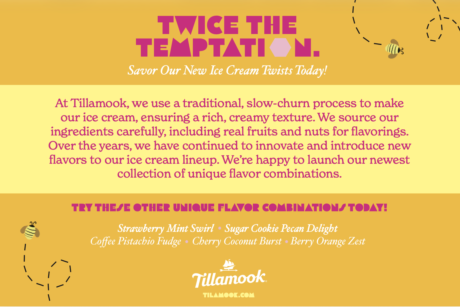
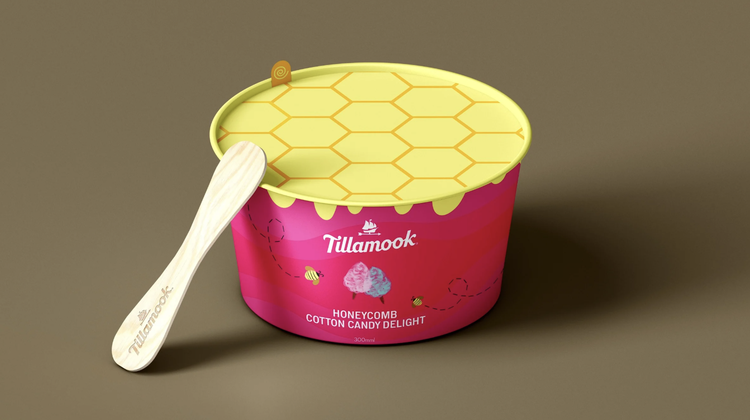
Above is the front and back of the postcard that will be handed out at farmers’ markets across Oregon to promote the new flavor. To the left is a mockup of the ice cream pint and what it would look like on the shelves.
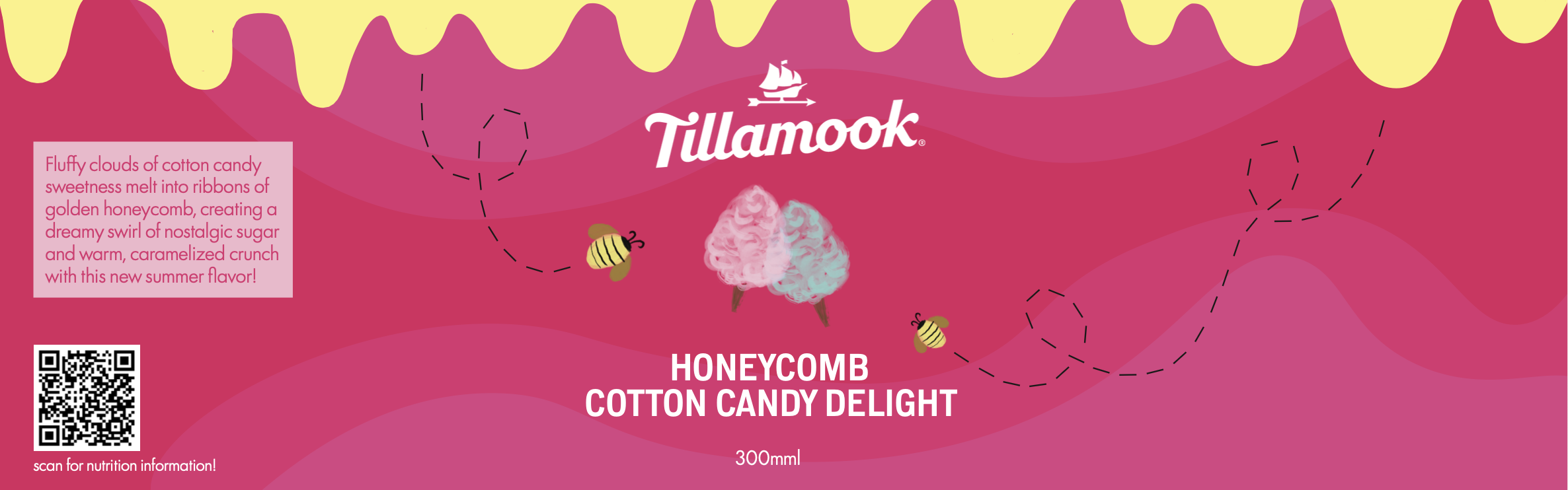
← Wrapper for the pint!
Another piece created for my Art Direction course, we were to design a two-sided postcard for Tillamook’s new series of summer mash-up flavors. These postcards will be handed out at farmers’ markets across Oregon, accompanied by samples to promote the new ice cream range. The design should include an expressive type lock-up as the focal point, with graphic elements to help depict the feeling of the flavor.
I was inspired by the traditional colors of cotton candy, yet I didn’t want it to scream “gender reveal.” Instead, I leaned into the pink as well as the warmth of gooey honey to create something that looked almost as sweet and light as cotton candy, while keeping the balance and edge of crunchy honeycomb.
Done almost entirely on Illustrator, I also used Procreate to hand-draw the “Cotton Candy” text and other small details, like the drips, bees, and cotton candy design.
*
Keywords: Airy, Nostalgic, Whimsical